MY ROLE
I was a UX Designer at Ford for 8 months. Before I was enrolled onto the project, I was tasked with a guided personal project to redesign the FordPass App. The app is used to control the users car. I wanted to create a more personalised and intuitive experience.
TIMELINE: 1 month
SKILLS: Figma, Adobe Photopshop
Problem
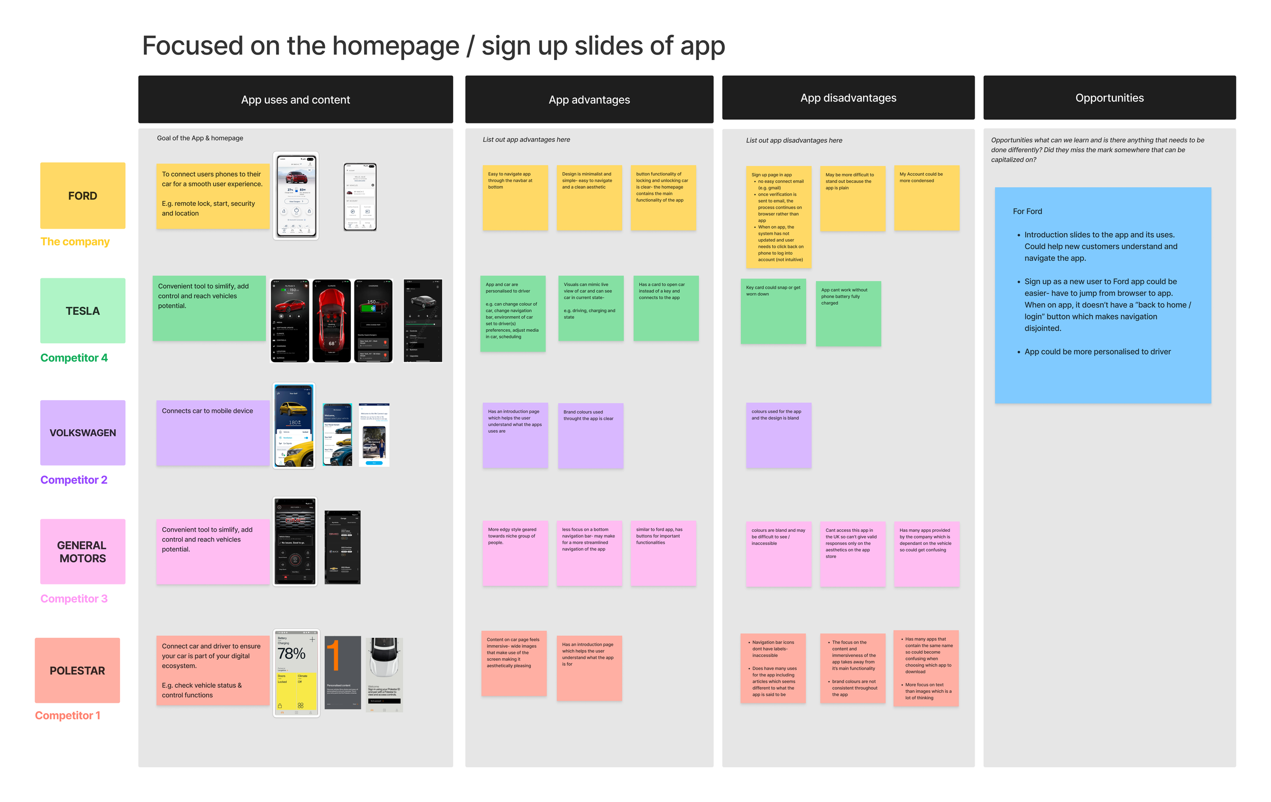
In order to understand how to make the app easier to navigate and personalised to the user, I decided to look at google reviews as well as apps of other car companies to understand how Ford could improve the current app. The main changes to be made were:
The navigation (particularly the controls for the car)
The layout of information. Users wanted this to be easily accessible.
Redesign
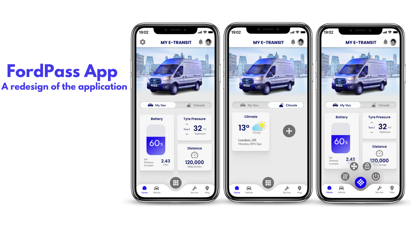
FordPass App
Landscape Research
I looked at the current app that FordPass had and compared this to other car competitors to see what they were doing to create an easy experience for their users.
Ideation
To figure out how I wanted to layout the home screen, I first created a diagram of how the FordPass app is laid out so I could figure out where to place each part of the app on the navigation bar.
The first home screen design was very bright and fun, however, I later changed the below to create better easy use of the app:
Car control buttons next to the car.
I later decided to change this design as it would be difficult for app users to reach for these buttons on the screen.
Colour scheme
The colour scheme I used in these designs were bright but included some designs that weren’t functional e.g. the circle below the van. I decided to change these so that it had a clean minimal aesthetic to be in line with Fords design specifications.
Next, I sketched out ideas of a navigation bar. At first, I was going to place the car controls on the bottom right of the screen for easy access, but realised that this was biased toward right handed people. So I later sketched a design with the button in the middle of the navigation bar.
Iteration
Taking on board the feedback on my first design, I decided to make changes to create a minimal and functional app. The main feedback and changes to make on my design were the following:
The car control button in the middle of the Nav bar
As it was the Ford logo used for this, it may confuse the user in thinking that the button is an aesthetic design.There were still designs that weren’t functional, such as the circle below the van and the gradient of the car status cards.
I set out on once last iteration to better this design.
The Final Screens
This was the final result after multiple reviews and feedback from stakeholders. I had been able to achieve a clean, functional and personalised app with the following:
Navigation bar
The car control button, instead of the ford logo, is now a menu button icon which creates less confusion for users.Minimal aesthetic
In order to align with Ford’s design principles, I followed their principle of creating a clean and minimal aesthetic. It also made for a less distracting user experience.Widgets added depending on user preferences
As seen on the last screen, users are able to add widgets of data they would rather see on their home screen to create a more personalised experience.
If I were to change anything about this design, it would most likely be the slide view- instead of naming the pages, I would instead have a slide with 2 dashes.
Reflections
I was very fortunate to receive the guidance and mentorship from colleagues who worked at Ford before I was launched into the project. They taught me a lot of the basics while working ina project. Here are things I learned:
Attention to detail is key
As this was my first time creating work similar to what a client would expect, I had to follow client design specifications closely. Remembering to recheck my work, particularly spacing, ensured that I was able to implement designs that aligned with the brand.
Experience is the best teacher
This was my first time creating work that was for a client, and although this specific project was a of what to expect before being launched into Ford, the feedback and guidance I received was invaluable. I knew what to expect once I entered the project, such as communicating with clients and meeting deadlines.
For more work inquiries, or if you want to chat,
email me at jasmindelac@gmail.com ☕️✨
Thank you for reading!
MORE PROJECTS


